

photoshop tutorial

for todays tutorial i took an image that i had already uploading and changed the curves and the explosure levels so that ll the colours apear brighter and they stand out more. i also used the clone tool to add a few more lights in so it looked more like a heart. i learnt that sometime the image looks better with less editing as when i tried to put quite a few new ajustments layers on it changed the image completly and it looked quite tacky and nasty so i un did my new layers ad left it like this . i f i was to change the image again i would be temoted to change it in to black and white and see how it comes out. i am quite happy with my work in this photo because i think i have improved the way it looks.
normal_d3770b8758b5afc5670fc08539ffc2b1.jpg

for my fashion photographer i choose nick knight as he is my favourite fashion photographer. the three photos i have choosen from his bloare ones which were published in vouge. i choose these images because they stand out the most out of all his photos. the first two are ones from the same shoot. choose them because of the floatness ans surealness on them, i love the way the material is just floating threw the air, all the colours are really bright and dont clash because of the use of white in the background which tones down all the colours so it still looks visualy pleasing. the next photo i choose because of the glare the model is giving stands out the most compared to the rest, and the way she looks quite innocent to start of with then you notice the make up she is wearing and all the gothicy things. in my photography i would try a fashion shoot with lots of different materials and see how it looks. to do this i would nee some quite big fans to move the material though so it could be quite exspensive.
nick-knight-dec-vogue-uk-11.jpg

for my fashion photographer i choose nick knight as he is my favourite fashion photographer. the three photos i have choosen from his bloare ones which were published in vouge. i choose these images because they stand out the most out of all his photos. the first two are ones from the same shoot. choose them because of the floatness ans surealness on them, i love the way the material is just floating threw the air, all the colours are really bright and dont clash because of the use of white in the background which tones down all the colours so it still looks visualy pleasing. the next photo i choose because of the glare the model is giving stands out the most compared to the rest, and the way she looks quite innocent to start of with then you notice the make up she is wearing and all the gothicy things. in my photography i would try a fashion shoot with lots of different materials and see how it looks. to do this i would nee some quite big fans to move the material though so it could be quite exspensive.
nkcaejkx97canglavpcadg33hpca170gurca24onpacakq4y9aca38kamycaxao1yscagtlgwfcawgzx34cagc1d9mcatsonefcam0981eca4fvdnbca74n89icavenievcatpvwrxca4zxaefcaat55m3.jpg
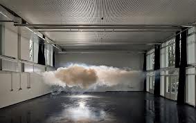
berndnaut smilde photos. im not really a fan of this selection of photos to be honest because i think they are all quite simualr and plain. the best one out of the lot is the one with the room that has a red floor and a blue back ground, i like this one because of the way the colours look quite normal life, i think the message that he is trying to send out is about global warming and the way the cloud is caught in a room and it can’t get out. all the photos were roughly taken in 2010 for a campaign. the location in where all the photos were taken is un known. the other two photos share the same textures asin all the walls are quite plain and then there is just the cload which is there, the clouds look like air and if in real life you touched them they would disapear. From these photos i have learnt that i like messier photos and more in it, these are just quite plain and they dont really do much for me or make me think.
a9caexm2w3caghmj2dcau3o6jgcars0kbgcawosl2xcarlmcdfcansoxsycafhycbwcabpsry7cai23wj3cawzi1a6ca2bil12camyagv7ca1zllvqca819wxhcai1ynnzca9paxz9caled94tcaoen8nd.jpg

berndnaut smilde photos. im not really a fan of this selection of photos to be honest because i think they are all quite simualr and plain. the best one out of the lot is the one with the room that has a red floor and a blue back ground, i like this one because of the way the colours look quite normal life, i think the message that he is trying to send out is about global warming and the way the cloud is caught in a room and it can’t get out. all the photos were roughly taken in 2010 for a campaign. the location in where all the photos were taken is un known. the other two photos share the same textures asin all the walls are quite plain and then there is just the cload which is there, the clouds look like air and if in real life you touched them they would disapear. From these photos i have learnt that i like messier photos and more in it, these are just quite plain and they ‘really do much for me or make me think.
2mcaqrsp4kcagubo10caews9bcca9rkemgcam6ghh8caoignirca31lkrycaxo9qjxca4ebf1scartuuefcag5dl4zcam7i51ncajyuygaca32h81uca624vfdca2e9mascawsr4iwcay0s498caewmkui.jpg

one point perspective

i took this photo up near the castle, i tried in a few a places to take photos however they had either too many things in the way or it looked messy. when i first took the picture i was going to edit out the bin truck however when i tried it looked a bit funny as it didn’t have a sure stop it just seemed to finish it off. This image was taking on my phone so it has gone a bit grainy so if i was to take this photo again i would use a proper camera so it wasn’t so grainy.
something i love

i choose to take this picture because i love fairy lights because i have always like them so i used a few strings i had in my room and had a play about to see which ones worked and which ones didn’t work. it was quite hard to capture the different light colors. to get this photo i had to use a tripod and a fast shutter speed because when i tried a slow shutter speed it came out really blurry.
depth of field
i choose this image for depth of field because i think it shows it quite well as the end of the picture is disappearing of the end. i took this on a fast shutter speed so i could take a few and capture it all not just focus on one thing.
